NodePing's status reporting pages allow you to set custom CSS on the page. This is a very powerful feature, but we understand that it can be a little daunting for many people to customize layouts using this approach. This page will identify some CSS selectors that are most useful for customizing key elements of the layout, and show some examples of CSS settings that you may find useful.
When you enter custom CSS in your report configuration, the content you enter is sanitized, and then inserted as the final style element in the HEAD section of the page. This means that it will override styles with the same selectors higher in the HEAD section.
Of course, the normal priority of selectors otherwise governs how CSS you add here interacts with the existing
page layout. You can see more about this generally
here and
here.
In general, though, type and pseudo-element selectors will lose in priority to class selectors, which will
be overridden in priority by id selectors. To help something win the priority, sometimes adding !important to
the style declaration can help. Anything set in the style parameter of an element on the page is likely to
not be something you can change. We have generally avoided using style parameters where it is practical to
do so in order to maximize the usefulness of the CSS customization.
This section outlines some selectors and features common to these pages generally.
You can modify the width of the overall page layout by setting the width on the flex and max-width properties of the #reportwrapper element. Note that in the default CSS for the page layout, these elements are styled using @media rules, so if you set this you may need to test your changes on different screen sizes to see how the rules interact. In general, unless you mean to change how the page flows overall, leave the two zero's in the flex property as they are. But in many cases this works fine:
#reportwrapper {
    flex: 0 0 90%;
    max-width: 90%;
}
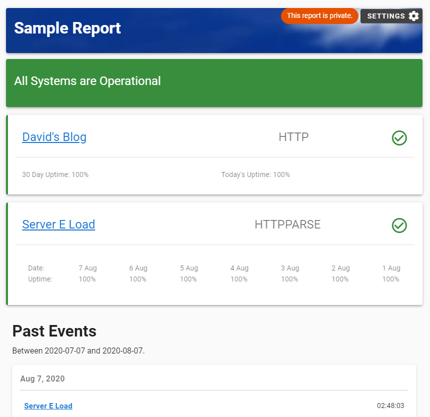
The Header element has an id of reportTitleContainer. This allows you to fairly easily customize the header element on the pages. For example, the sample report displayed above was created using this in the CSS block for the report:
#reportTitleContainer {
    background-image: url(https://nodeping.com/images/cropped-banner-bluesky2.jpg) !important;
    background-repeat: no-repeat;
    background-position: right;
    background-color: #0c388c;
    height: 90px;
    color:#fff;
    border-radius: 4px;
    padding: 16px;
    box-shadow: 0 3px 3px -2px rgba(0,0,0,.2),0 3px 4px 0 rgba(0,0,0,.14),0 1px 8px 0 rgba(0,0,0,.12) !important;
}
This could be simplified and optimized, but this example gives an idea of some of the things you can do with the report headers. The actual text (content) of the header element is set in the report configuration under "General Settings". If you don't have anything in the Report Banner field there the block won't be displayed even if you set CSS for it, so you need at least some placeholder text if you want the banner to just show something like a logo image.
#poweredbynodeping { display: none; }
Entering content in the Footer block of the "Custom Content" section of your report configuration will create a div element with an id of "customfooter," which can be used to style this block of text. This can be customized in a manner very similar to the header, discussed above. For example:
#customfooter {
    border-radius: 4px;
    color: white;
    background-color: #333;
    padding: 1em;
}
This section provides information about selectors and features specific to the main Status Events pages.
The banner and footer for this page is described above.
The background of this block changes based on whether all of the checks displayed on the report are "up" or not.
If all of the checks are "up" then the "summaryblockup" class is applied to the block. If any of the checks are
"down" then the "summaryblockdown" class is applied to the block. This makes it really easy to change the color
used in the element's background to show the overall status of your checks. These classes need the
!important declaration.
If you are showing the list of "down" checks in the summary block, these will be in an unordered list
(ul tag) with a class of "summarydowns".
.summaryblockdown { background-color: #933 !important; }
.summaryblockup { background-color: #393 !important; }
Another class applied to the Summary Block, "dashboard," is shared with some other block elements on the page.
Each check is displayed in a div with a couple of different classes applied, but the main one to use here is "jobrow".
Because of the way the other classes and styling works here, it is likely you'll need to use the !important
declaration to make sure your styling for these elements appear in the page. The check blocks are also given an "up" or
"down" class, which by default puts a red or green band on the left side of the element.
Each check's block also is given a class of "up" or "down"
The example below sets the check background color to grey, changes the red and green colors in the up and down indicators sligtly, and makes the down's colored band wider to make it more visible:
.jobrow { background-color: #CCC !important; }
.jobrow.up { border-left: 5px solid #393 !important; }
.jobrow.down { border-left: 8px solid #933 !important; }
The overall event container is #eventcontainer.
You can style the Event block title using #eventcontainer > h1
The listing for each day has a class of "eventday". This class needs the !important declaration.
#eventcontainer { padding: 1rem; }
#eventcontainer > h1 { color: #A06; }
.eventday { background-color: #EFE !important; }
The Support Note is intended to allow you to add a message between the status summary block and the list of checks. You can put just about anything here, such as links to your support site or other contact information, or general messages about the status of your services. The block, if it is present, has an id of "supportcontent". Since there are all kinds of things people might use this block for, we have left it fairly plain. The block supports HTML for links and images. This works best if you give the tags you put here their own ids or classes, which you can then add to the CSS.
This section provides information about selectors and features specific to the individual check status pages.
The Check Status pages support setting defaults for all of your pages, as well as setting the styling for a specific check status page for an individual check. This is an either-or feature. If you set CSS for an individual check's page, that CSS will be used instead of any "default" you have set for your accounts. So if you have CSS in your default setup and you are going to customize an individual check's page, it is generally a good idea to just copy and paste your default as the starting point for the customized check page.
The banner and footer for this page is described above in the Common Page Elements section.
The background of this block changes based on whether the check is "up" or not.
If it is "up" then the "summaryblockup" class is applied to the block. If the check is
"down" then the "summaryblockdown" class is applied to the block. This class needs the
!important declaration.
The block has a class of "checkprops". The labels and values have classes of "propertylabel" and "propertyvalue".
The block has a class of "uptimecontainer".
The block has a class of "resultschart". Since the page can have multiple charts, they do not have a predictable id, and in fact the id is set on each page load, so it cannot easily be used as a selector. It is, however, possible to do some styling of the charts by using descendents of the "showingchart" class, which is a wrapper for the chart itself. One noteworthy class within this block is the chart title, which has a class of "cardtitle".
As a rough example, you can increase the size of the text in the chart like this:
.showingchart text { font-size: 20px !important; }
If you are examining the elements in the chart, it is helpful to have the Report Settings panel open, because this prevents the report from reloading the data and re-rendering the chart while you are trying to look at it.
The block has an id of "resultstablecontainer". Like the charts, the results table is very dynamic, which makes giving individual elements in the table predictable ids difficult. However, you can style the table using descendents of the parent block. For example, this will make the rows in the table smaller:
#resultstablecontainer td { height: 16px !important; }
The block has an id of "eventcontainer". Individual days have a class of "eventday", and individual events have a class of "event".
These are blocks of text or other content that you can add to the page. It is intended to be very flexible, and allow you to add arbitrary content to the page. This can be useful, for example, for information on how to contact your support team. The first block appears in between the Uptime and the Results Chart. The second block appears between the Results Table and the Event History. The blocks share a class of "supportnote", and the individual blocks have an id of "checknote1" and "checknote2".
We're here to help. If you have questions or comments, please contact support.

 Documentation
 Development
 Premiere
 Check Types